10%
City of Boardman
The Brief
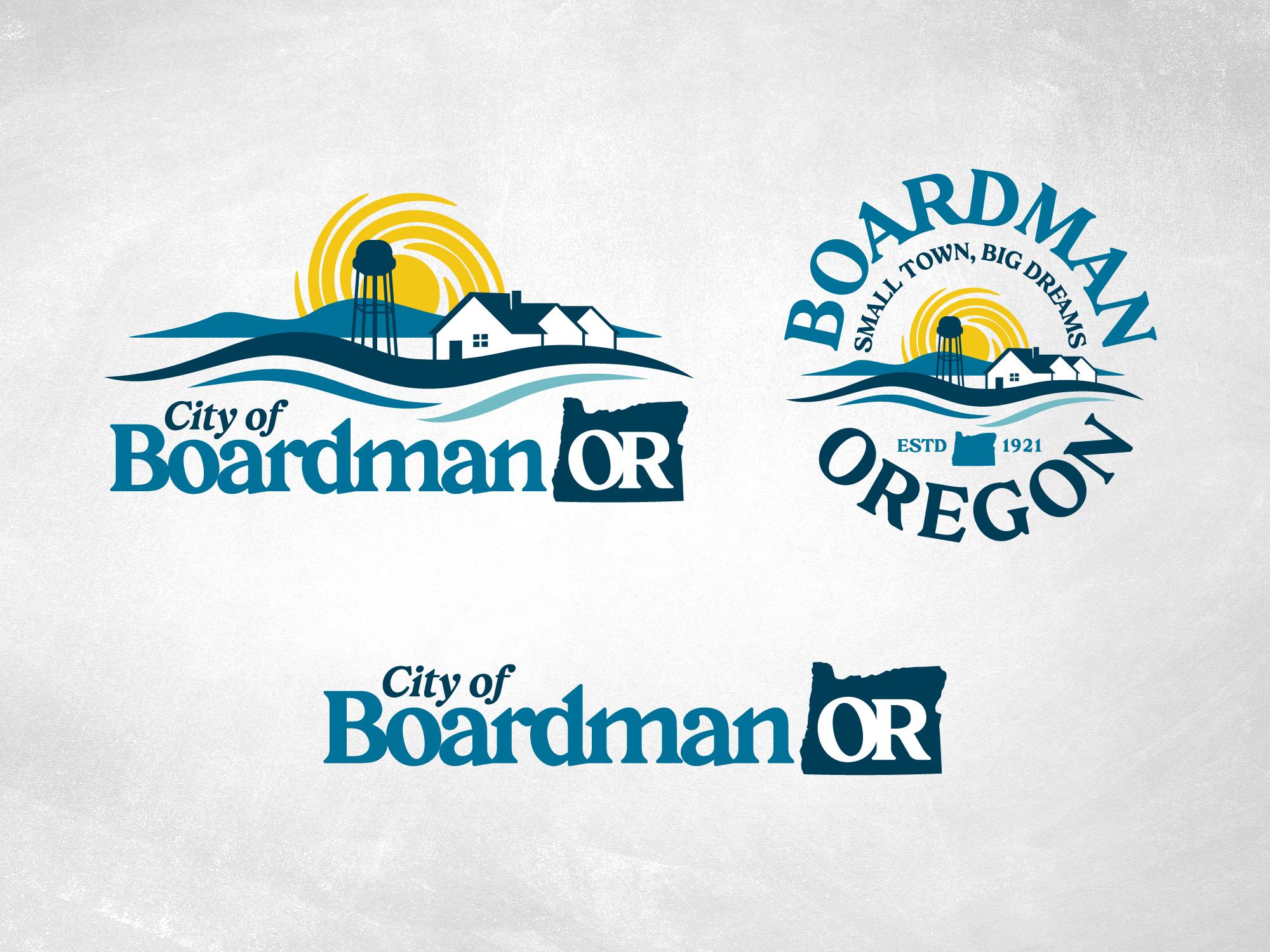
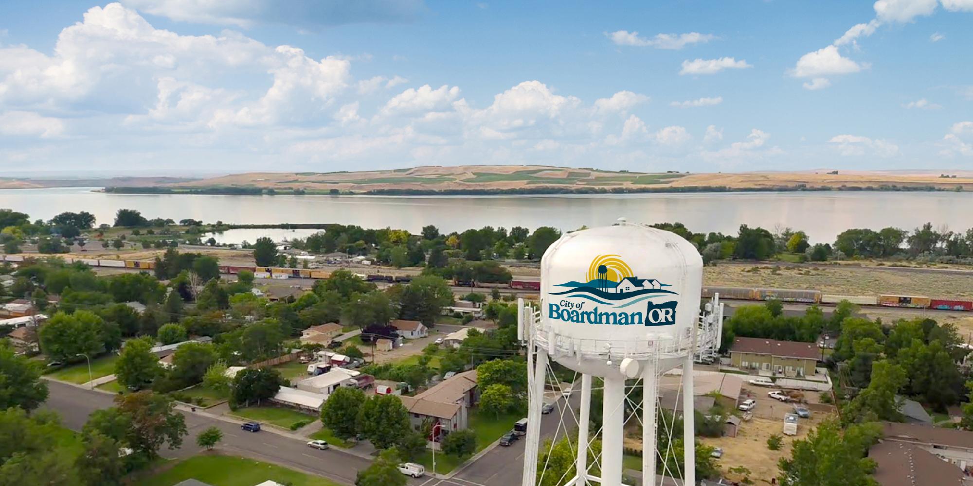
A community in Northeastern Oregon with a history just over a century long, the folks at the City of Boardman were seeking to create a community brand that reflects the values and scenery of the sunny region. Known primarily as a thoroughfare along I-82 to Portland and for its sweeping views of the Columbia River, Boardman needed a consistent brand that residents and passers-by could connect to. Focal Point was tasked with capturing the community’s charm and landscape in a series of brand marks that would provide the continuity the city needs for its next chapter.
The Challenge
When developing a community brand, it’s important to get input and feedback from people within the community for optimal success and rollout. With this project, it was no different. Focal Point worked with the City Manager and City Counsel throughout the process to dial in what cornerstone elements best represented the City of Boardman. As we heard opinions and ideas from this diverse group of people, it’s no surprise that not everyone agreed on what’s best for their community.
The Solution
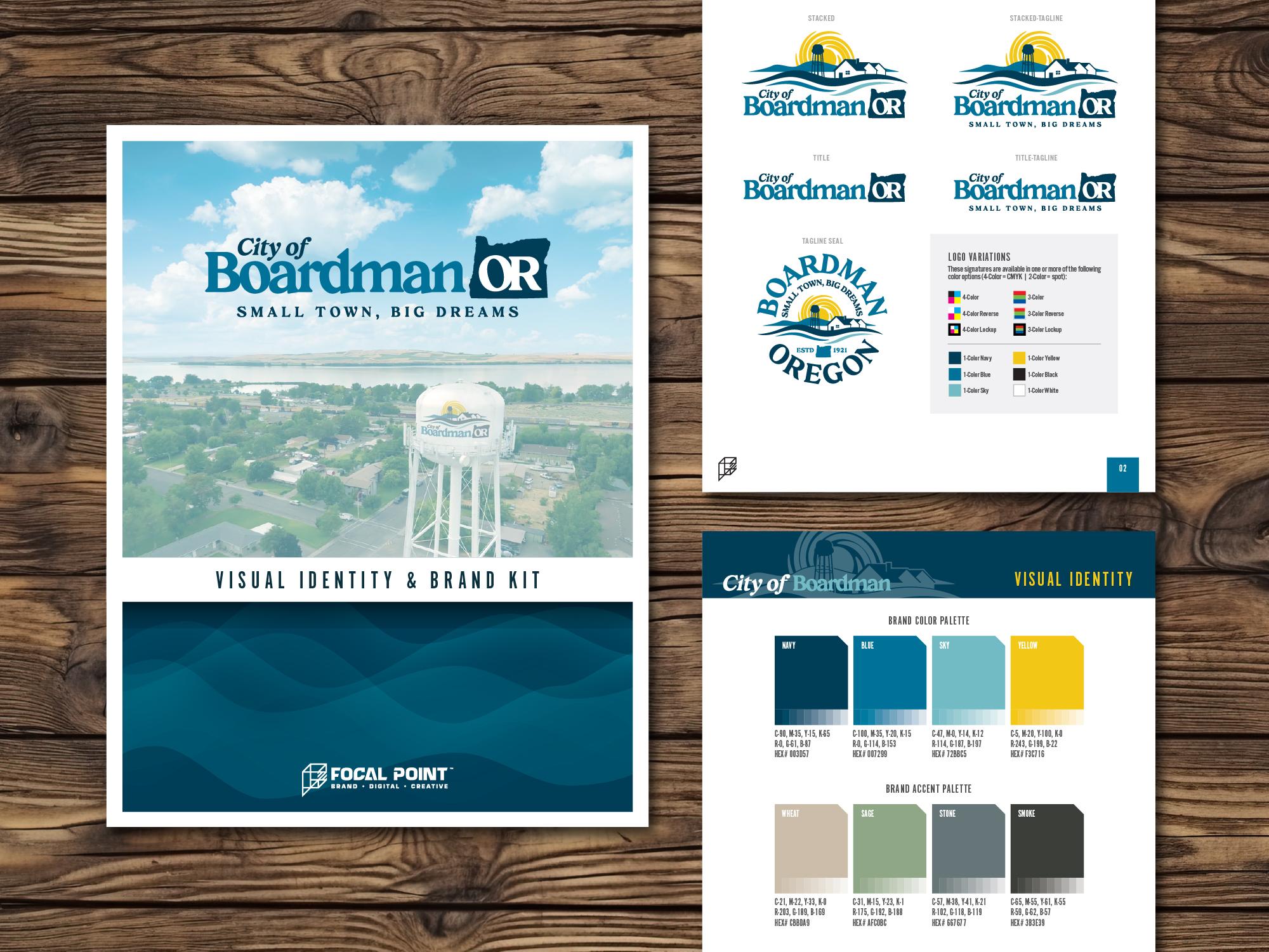
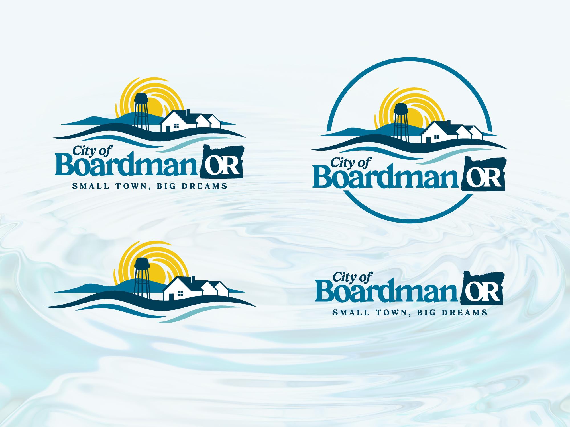
The contributions from the City Counsel reinforced the visual cues the community desired for the brand marks – focusing on the scenic landscape of the Columbia Gorge, sunlight, and of course, the water tower. There was also a strong desire to include a reference to the residents of the community. For this, we included residential rooftops in the landscape as a nod to the steadfast residents that make up this hardworking town. Surprisingly, we were able to pull off a landscape that included all of their requests without the composition being too busy. From there, we rounded out the kit with marks that gave the city options for all their future needs.
The Results
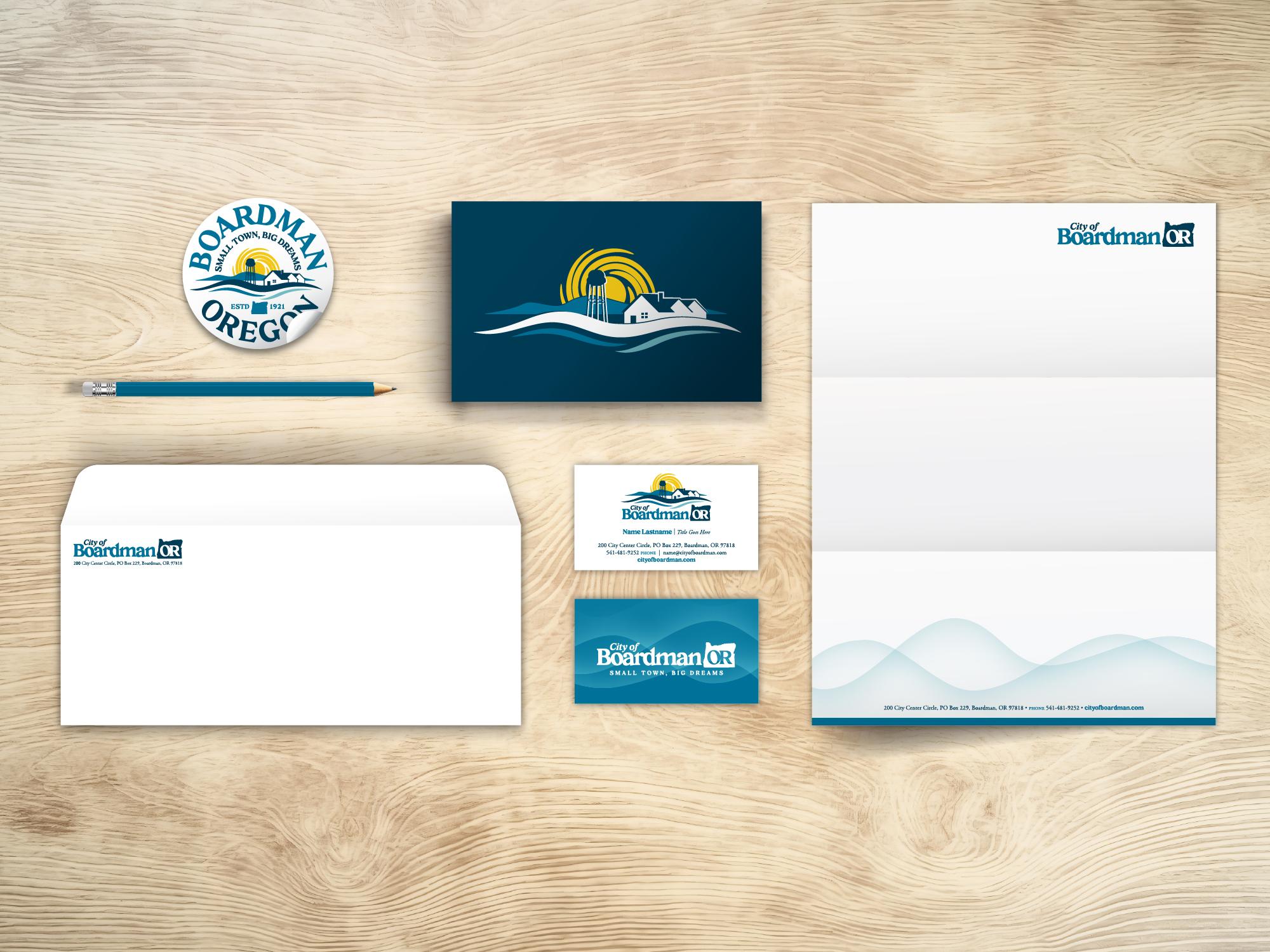
Perhaps one day the new brand will don the water tower, but for now the City has begun implementing just about everywhere else: their website, community signage, print materials, you name it. The final brand kit included variations with the city’s new tagline, “Small Town, Big Dreams,” which was the winning submission from a local resident in a tagline contest the community organized to get involvement from its constituents. With community involvement throughout the process, it has been widely celebrated, and the small town is rallying behind the new brand.
The Metrics
Print Design
100+
40+
