92%
City of Hermiston
The Brief
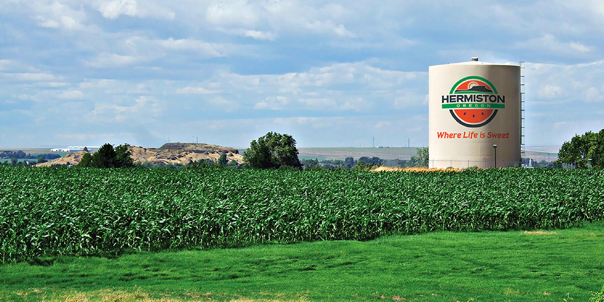
With a reputation for “world-famous watermelons” and widely considered an agricultural hub of Northeastern Oregon, the community of Hermiston, Oregon has a lot to be proud of. In 2016, the City began the process of developing a community logo and tagline that the residents could rally behind. A small group oversaw the development, then did a soft launch of the new mark with the tagline, “You can grow here”. The only problem? It coincided with the state’s newly passed cannabis law allowing pot farms and retail sales. Needless to say, the public did not respond well and the City leadership sought Focal Point’s help in a brand do-over.
The Challenge
Focal Point came on board with the following tasks: learn the nuances of WHY the proposed brand didn’t work and jive with the general public; engage the community in a rebrand process so that there’s buy-in with what the City is doing; develop a memorable brand mark and tagline that captures the heart of the community; and finally, create a rollout strategy that reinforces what makes Hermiston unique and provide the City with the tools and resources to have a successful brand launch.
To achieve all of those goals for the contract, we needed to expand our project team, particularly in the area of marketing and brand strategy to assist with the research, interviews and strategy development. Then, we knew that we’d need to get community support by including select public figures and individuals in the process. Finally, we needed to test the brand concepts and taglines with the general public to get real time feedback to measure which direction would have the most success.
The Solution
For a project of this size and scope, there was a lot of work to do before we ever picked up a pencil to work on designing a new brand. We partnered with Rochelle Olsen at Prominence Public Relations to help interview key community stakeholders; lead and coordinate a community branding committee comprised of City employees, residents, select business owners and even a few high school marketing class students; as well as analyze found data and write the final marketing and brand roll out strategy.
To gather diverse perspectives, we interviewed key City officials and council members, a handful of prominent business owners, representatives from the chamber of commerce and local Rotary clubs, as well as board members from the City’s rodeo commission. Armed with a lot of different points of view on the city’s history and why the initial brand/tagline rollout wasn’t successful, we were ready to begin the workshop phase.
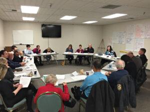
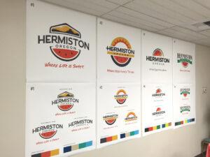
Over the course of four separate workshop meetings with the community branding committee, we worked with this group of community members, young and old, to lay the groundwork for the visual identity development. Consisting of word association activities that had people writing, sketching and engaging with one another, Focal Point collected a copious amount of notes, worksheets and ideas that would influence the brand concepts and tagline development.
Through these workshops, we developed and fine-tuned the brand concepts down to two options, with two proposed taglines: “Where Life is Sweet” and “Where Opportunity Shines.” These final concepts were then tested with the Hermiston general public, both through online surveys as well as manned stations outside the local Walmart and other high traffic pedestrian areas. Returning nearly 1,200 responses, the Hermiston community weighed in and overwhelmingly selected what is now the final brand and tagline options.
The Results
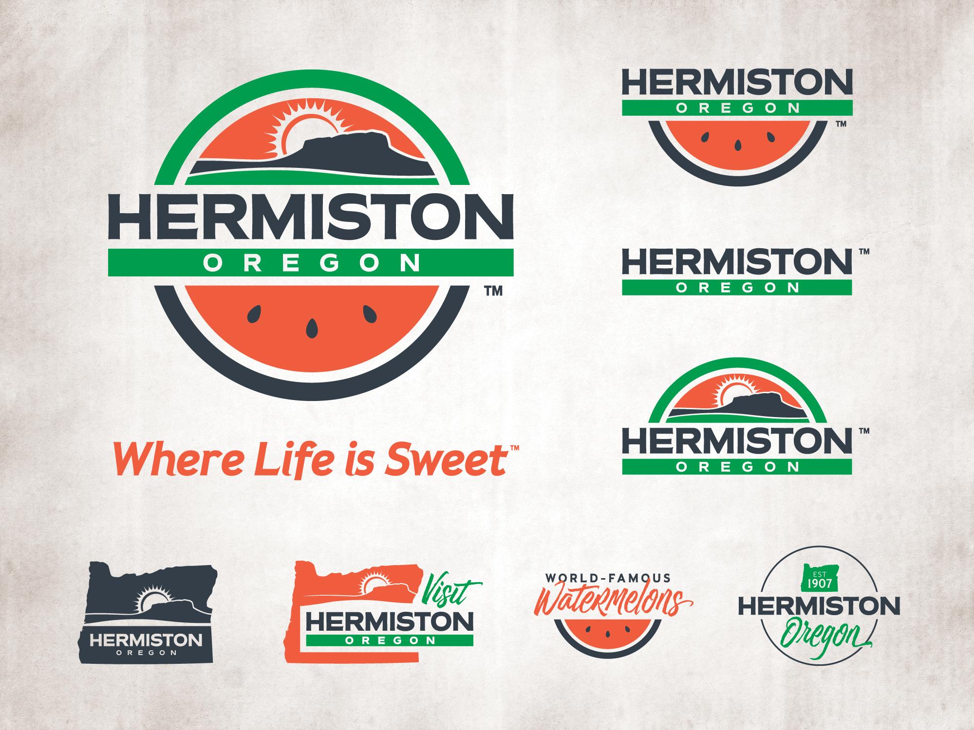
The final selected brand mark was both clever and multifunctional, a modular composition to be used as follows: the full, circular logo acts as the seal signature; the top-half only as the horizon signature; the bottom half only as the watermelon signature; or use the middle portion only as the title signature. Additionally, the final tagline chosen, “Where Life is Sweet”, allows for a plethora of options and variations depending on the entity using it, changing out the word “Life” for Business, Education, Recreation, etc. “is sweet.”
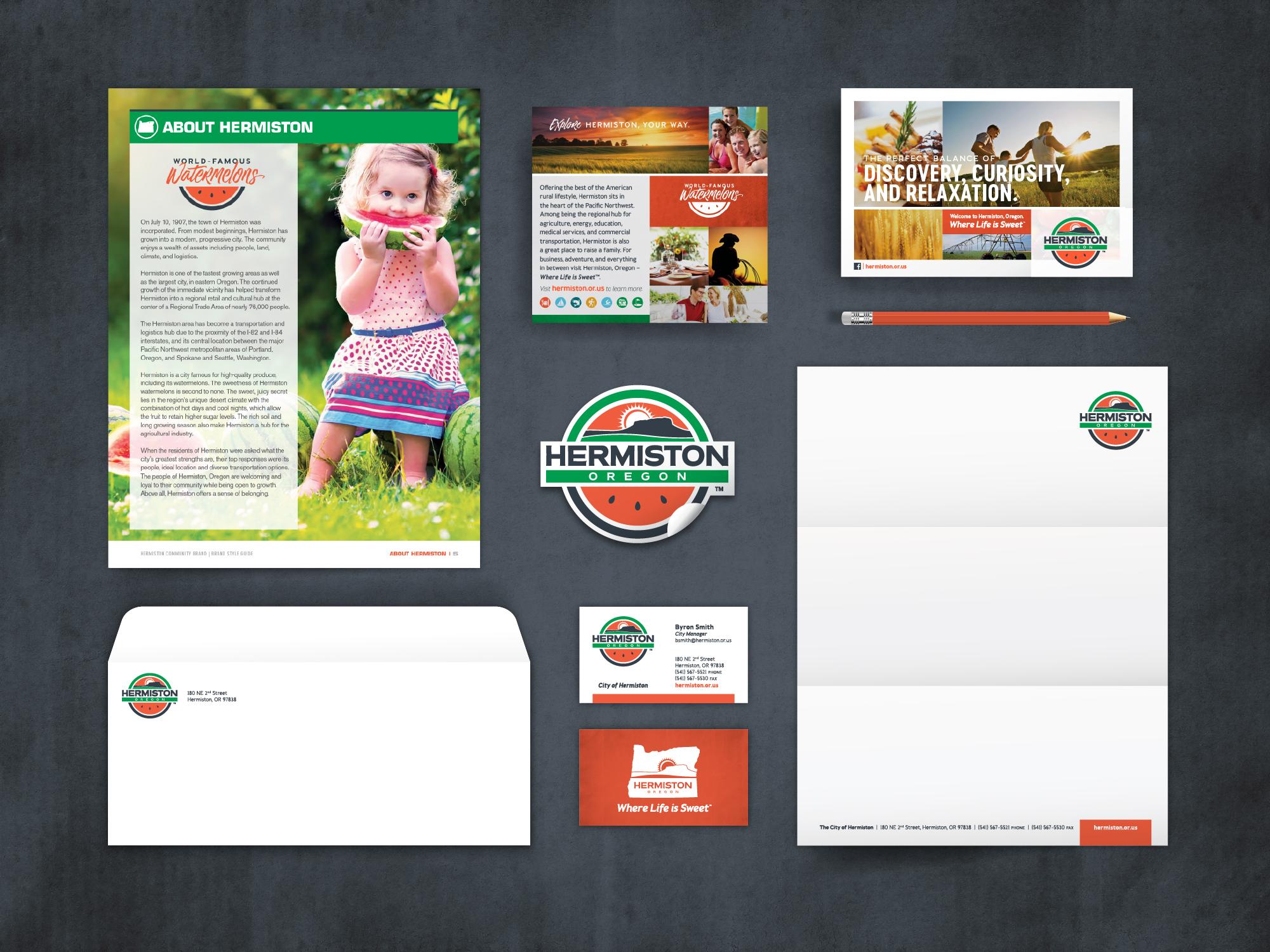
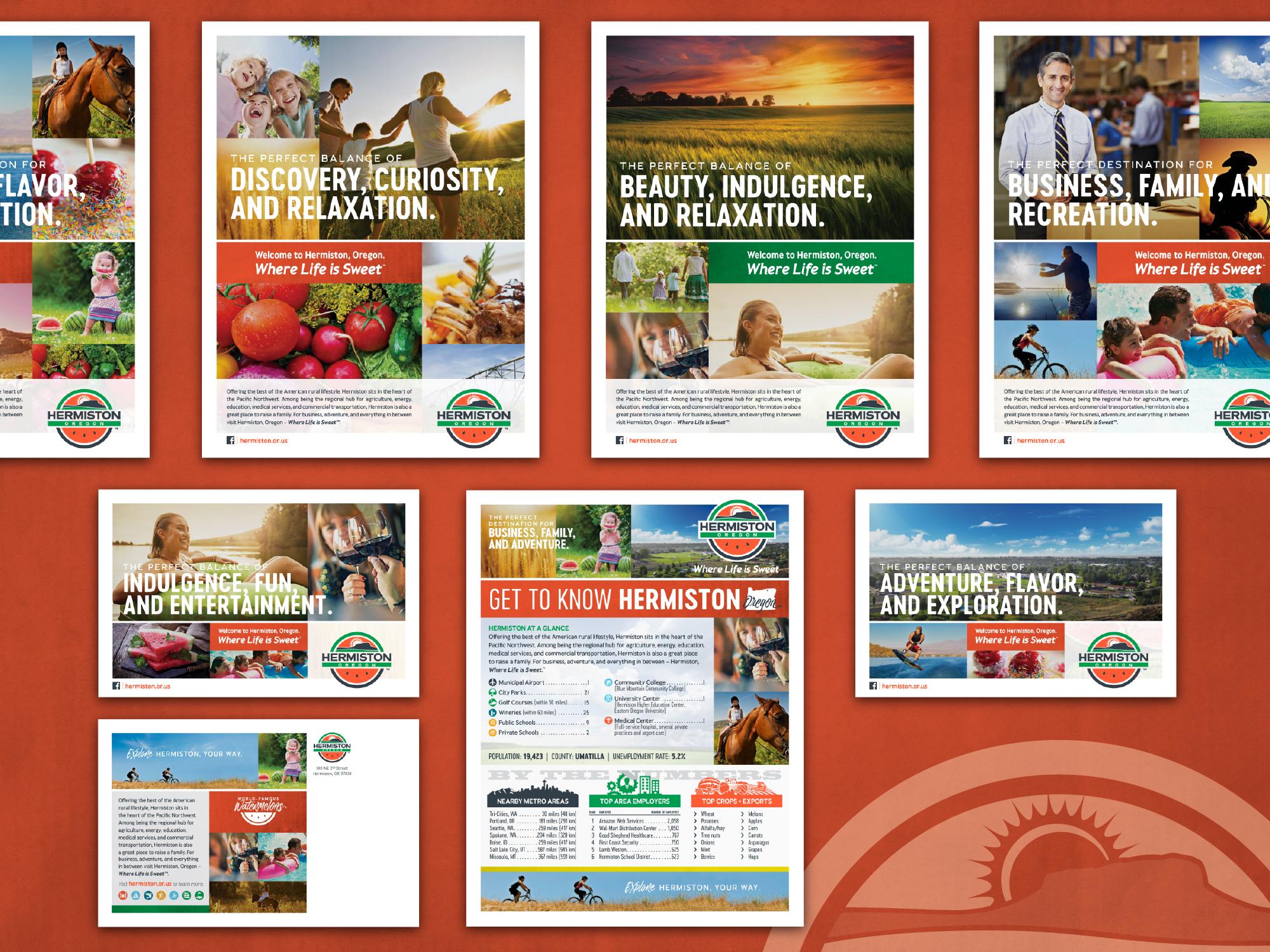
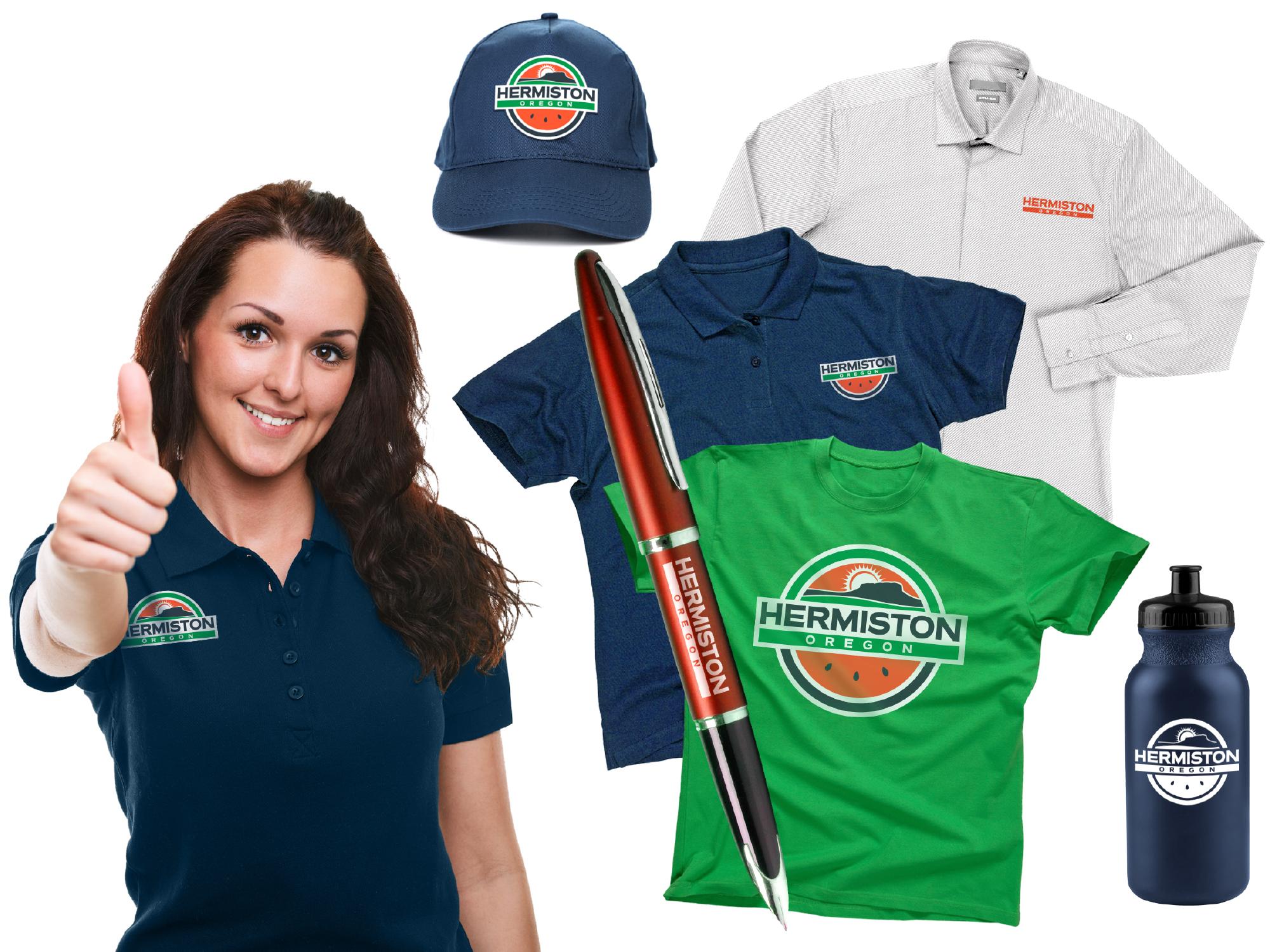
Having Hermiston community members’ involvement at all levels (students, business owners, public figures, etc.) throughout the process, it was broadly admired from residents upon rollout. In the time that has passed since the launch, the town has embraced the brand with an excitement and sense of ownership, proudly repping the brand through apparel, decals and more. The City has found fun and creative ways to use the brand marks throughout the various levels of government. Branded light pole banners line the streets, interactive kiosks to promote tourism installed near their city center, custom logo variations for utilities and other departments – you don’t have to look far to see how the brand has come to life.
The Metrics
Print Design
200+
100+
